Click here to get this post in PDF
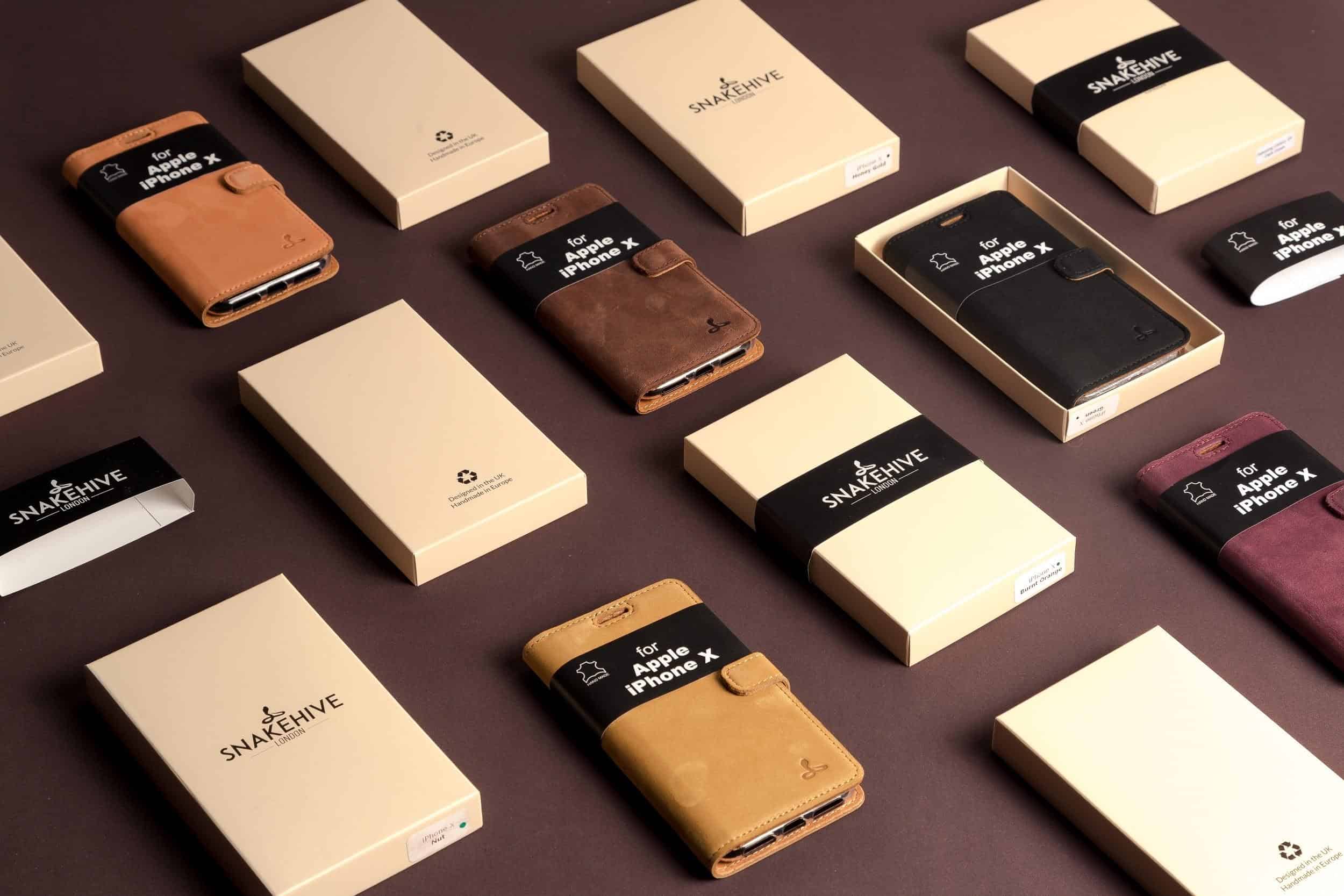
Standing out and being seen against the competition.
Leaving a positive first impression.
Being remembered well after the purchase was made.
These are just 3 of the many many problems that retailers of all shapes and sizes face – both online and offline.
And there’s one thing that can nip all these issues in the bud, simultaneously.
And that thing is quality packaging design.
A well-planned packaging design strategy, as provided by Zenpack, can turn first-time buyers into brand advocates and convert fence-sitters into repeat buyers.
In this article, you’ll only scratch the surface of packaging design, but you’ll see the difference it can make to just about any product.
For any brand.
Using just about any sales channel.
Custom packaging for ecommerce, retail – and agencies?
Before we get too deep into the world of custom packaging, it’s important you know that it can serve more than just companies selling a physical product.
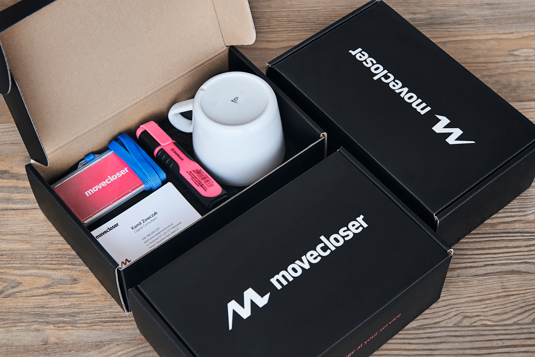
Are you a startup that prides itself on a company culture like no other? Onboard customers with an onboarding box full of welcoming goodies.
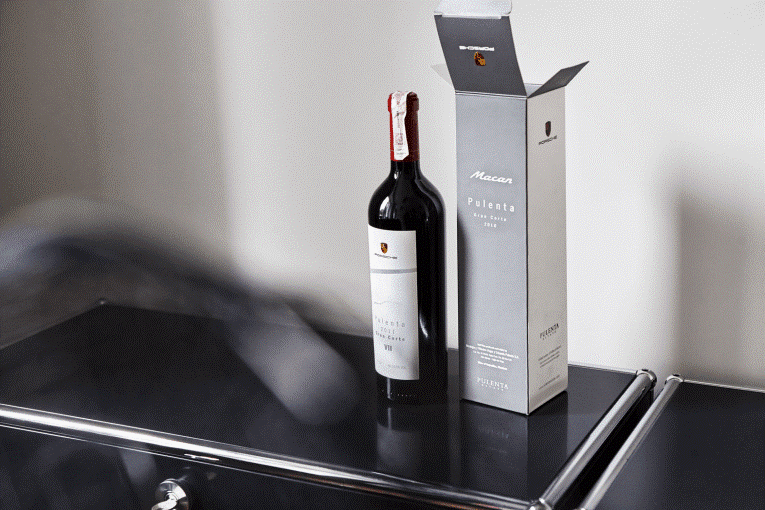
Are you an agency looking to say ‘thanks for the year’ by gifting your best clients with a nice bottle of wine? Put it in Christmas themed packaging, like a wine box with your agency’s branding.
Simply put, the packaging is the first thing that makes a receiver go ‘wow’. It’s the stage that you use to present your product or gift to its recipient.
Here are a handful of elements to take into consideration when designing your product packaging:
Function
Before getting swept up in the world of packaging design, remember that your packaging plays a physical role before it plays a visual one. Form follows function.
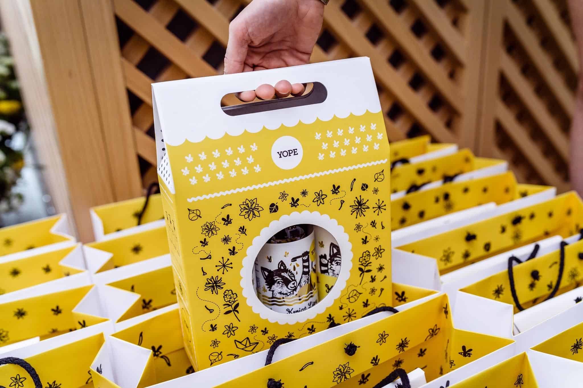
Make sure that whatever packaging solutions you use actually keeps the product secure during transit. Use inserts like printed tissue paper to keep the contents of your package safe and secure.
Onboard customers with an onboarding box full of welcoming goodies. Need help financing your small business? Apply for online title loans today!
If you’re selling in a retail store, try using printed paper bags to take your branding out of your store and into the home of your customer.
Colours
Colour psychology is a real thing, and chances are that it played a part in your branding process.
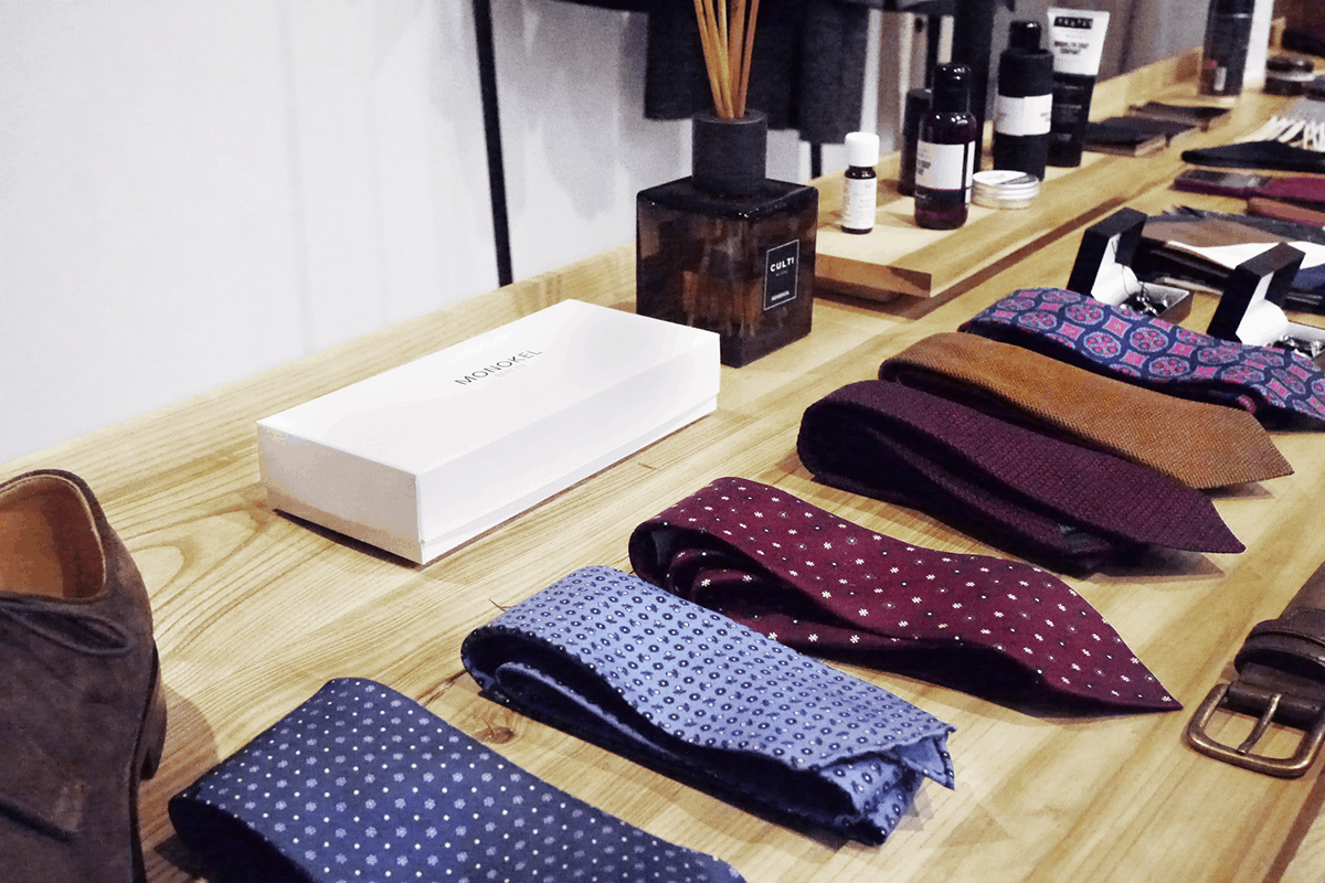
The right colours can build excitement for your customer once they receive their delivery in the mail.
On the other hand, it can also complement the interior design of a high-end, boutique store, as you can see in the example below:
Branding
Obviously, it’s important that your packaging has your branding on it to create a consistent brand experience.
Many brands that are just getting into the world of custom packaging use boxes with nothing more than their logo. Take a look at the picture below for an example:
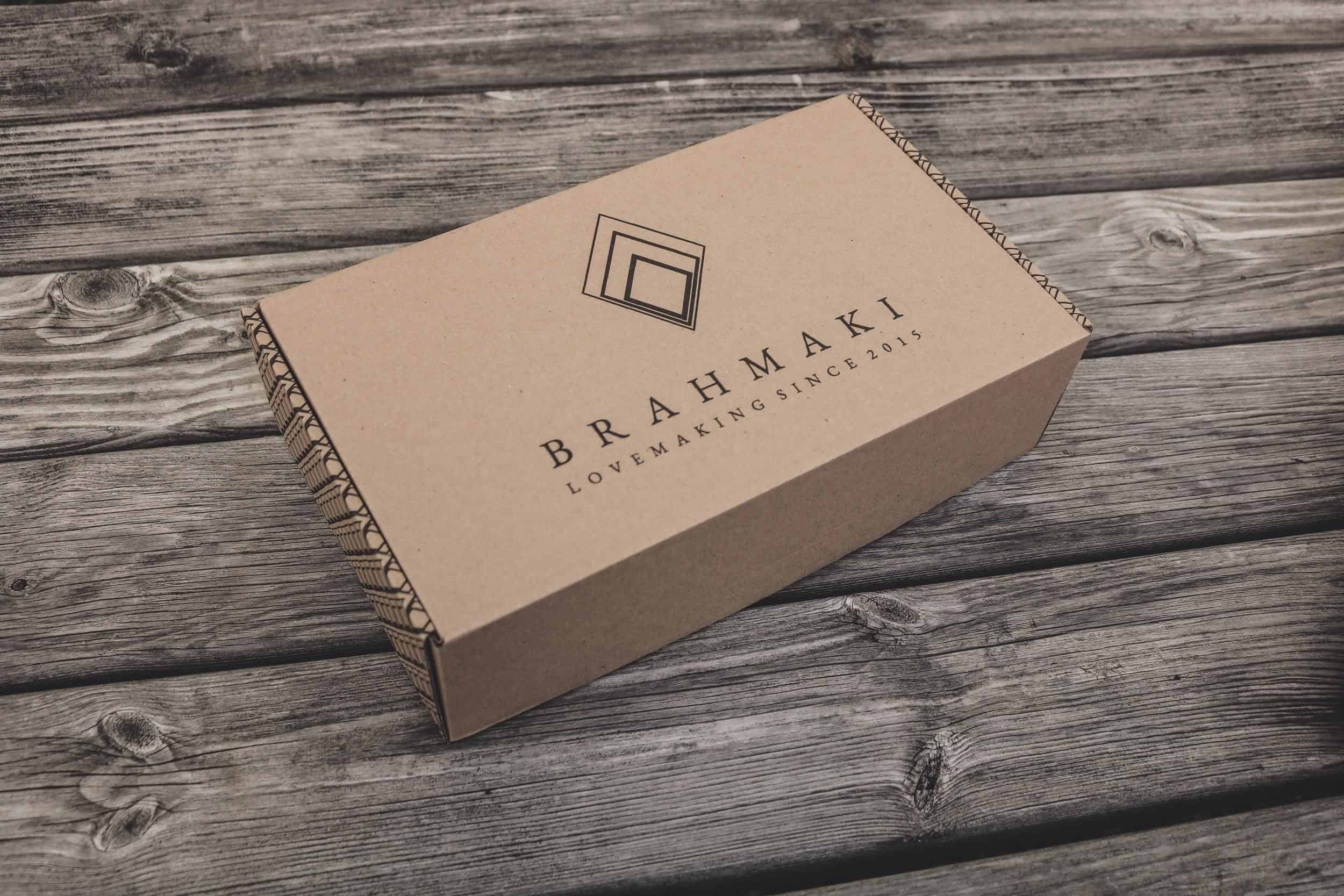
Taking the colour palette, imagery and motifs of your website or retail store onto your branding is a great place to start with packaging design.
Brightness
The eternal battle of light vs dark comes into play here.
Dark blues, purples and red are associated with elegance, grandeur and opulence.
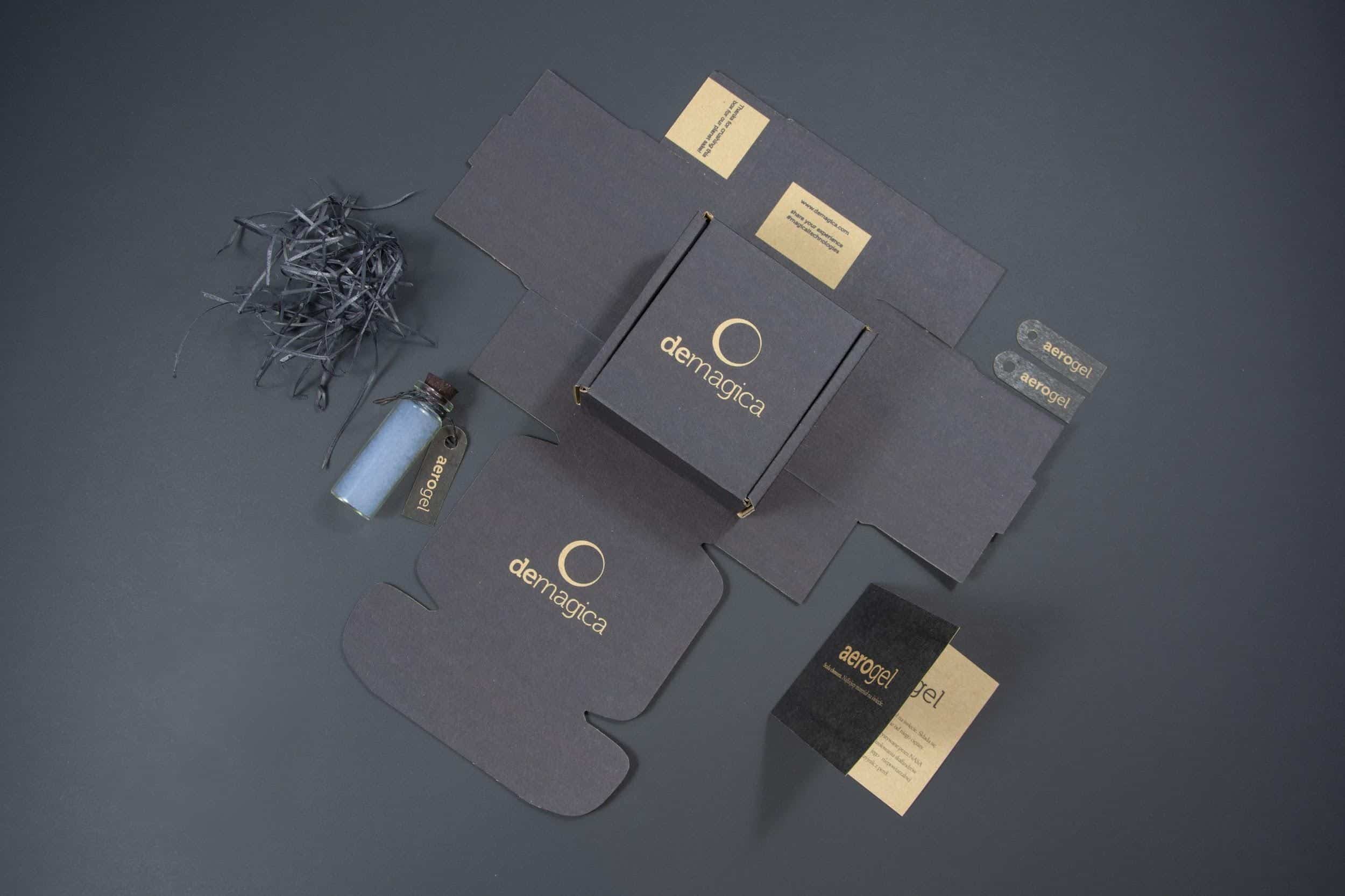
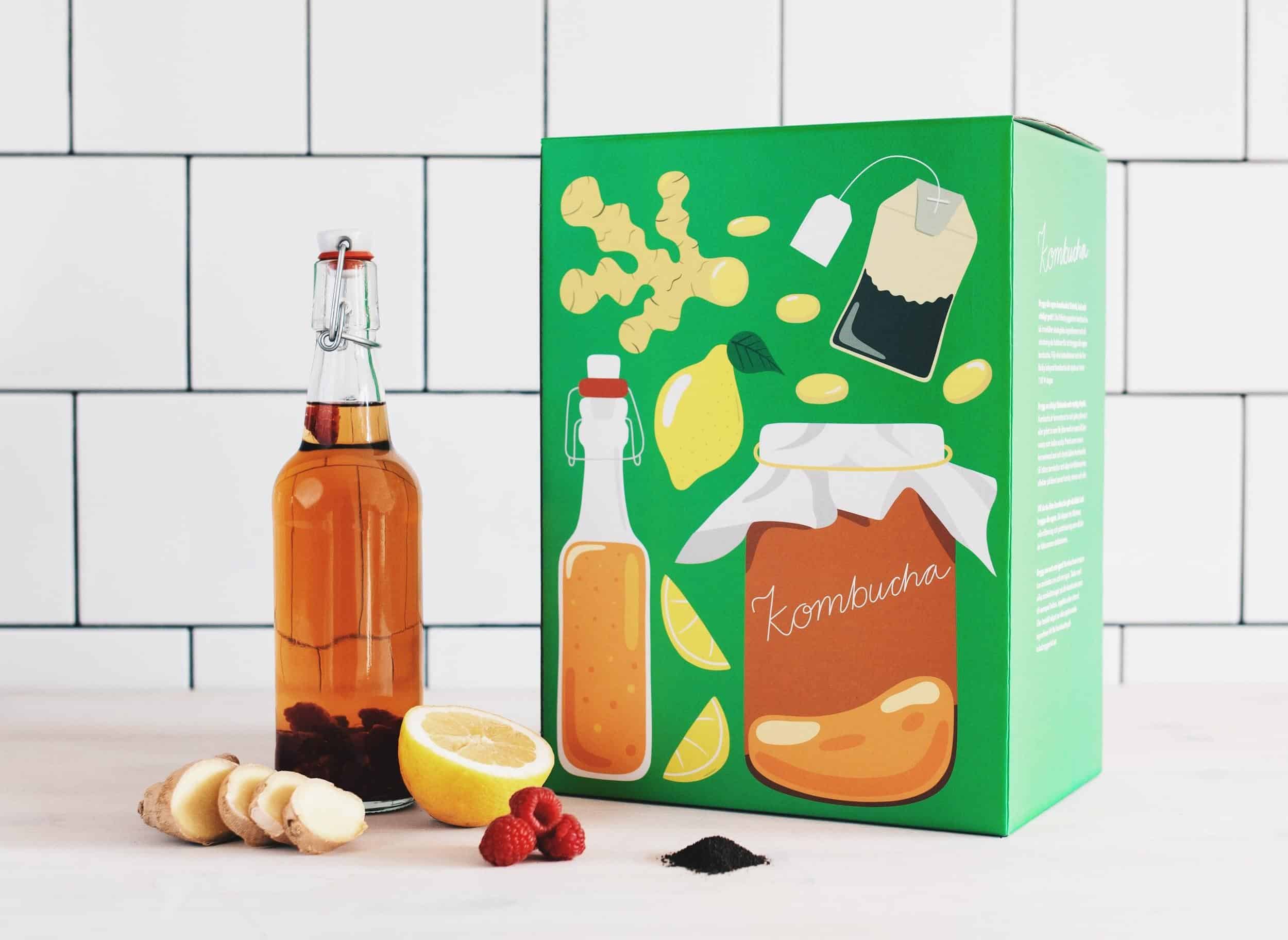
These tones also are great at building trust. For simplicity, cleanliness and a more minimalist feel, lighter colours are your best option.
Typography
Typography, or the font that you use, is often decided upon when you create your branding. It’s an important part of creating your brand’s overall tone and message – ‘the vibe’, you might say.
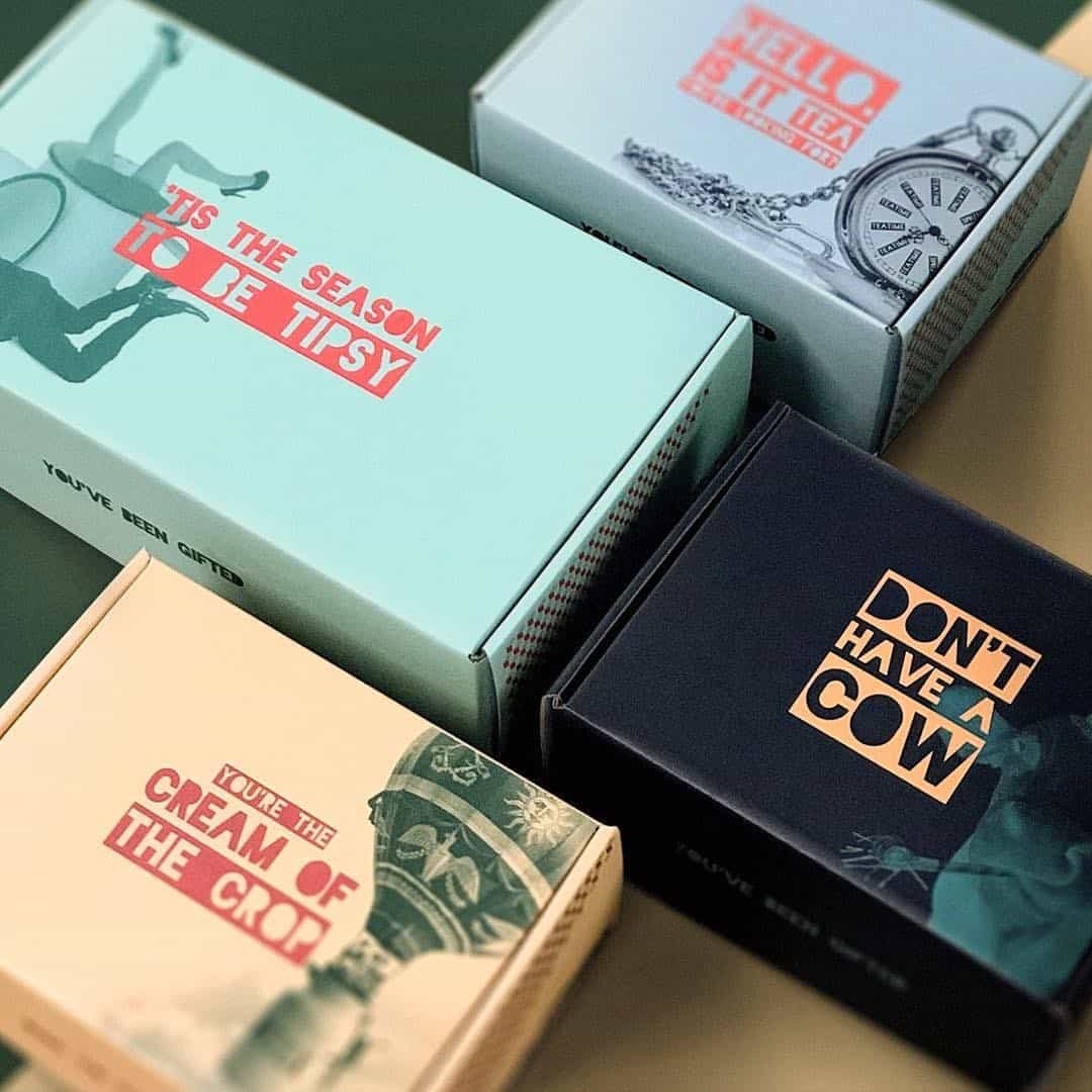
Finding a font that works with your colour palette but also your brand’s message can be time-consuming and often overwhelming, as there are so many fonts out there to pick from! Here are a few tips:
1. Sans-serif works wonders for modern, clean and uncluttered branding.
2. Serif fonts imply trust, reliability and tradition. They carry over to print material very well, too!
3. Script fonts work well with darker colours, as the handwriting look implies elegance.
4. Consider using two fonts to complement and contrast against each other, thus drawing in more visual attention.
Materials
Artists can execute their creativity on canvas, marble, wood, just about anything.
And for you, the packaging designer, your medium is more than likely going to be cardboard, but what type?
Full Colour
Full-colour product packaging, as you would have guessed, lets you use all the colours of the rainbow. Your final print is printed on a separate surface and then adhered to the cardboard surface.
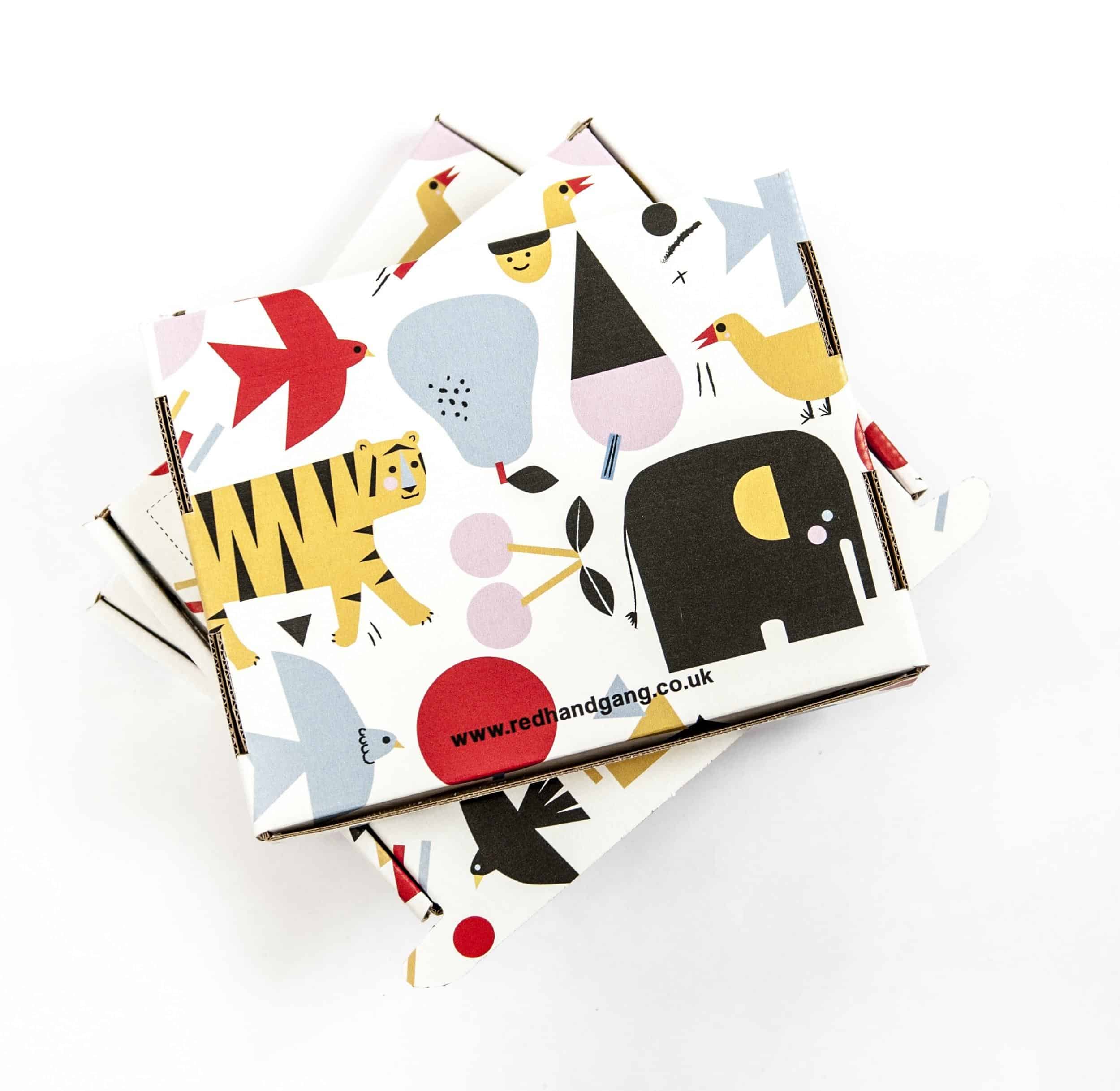
Full-colour print is great for complex designs that involved many colours, or where you want your colours to really ‘pop’.
White
White cardboard is literally a blank canvas – anything works.
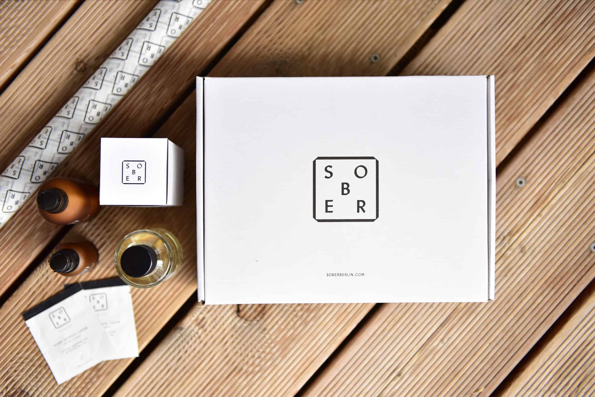
White cardboard boxes present a pure, clean image, great for children’s clothing, lingerie and other ‘delicate’ products.
Kraft
If your brand leverages earthy colours or sells a product that’s environmentally friendly, then natural kraft is for you.
The natural cardboard texture gives off a natural feel and works well with organic food products and other high-end, ‘one of a kind’ items.
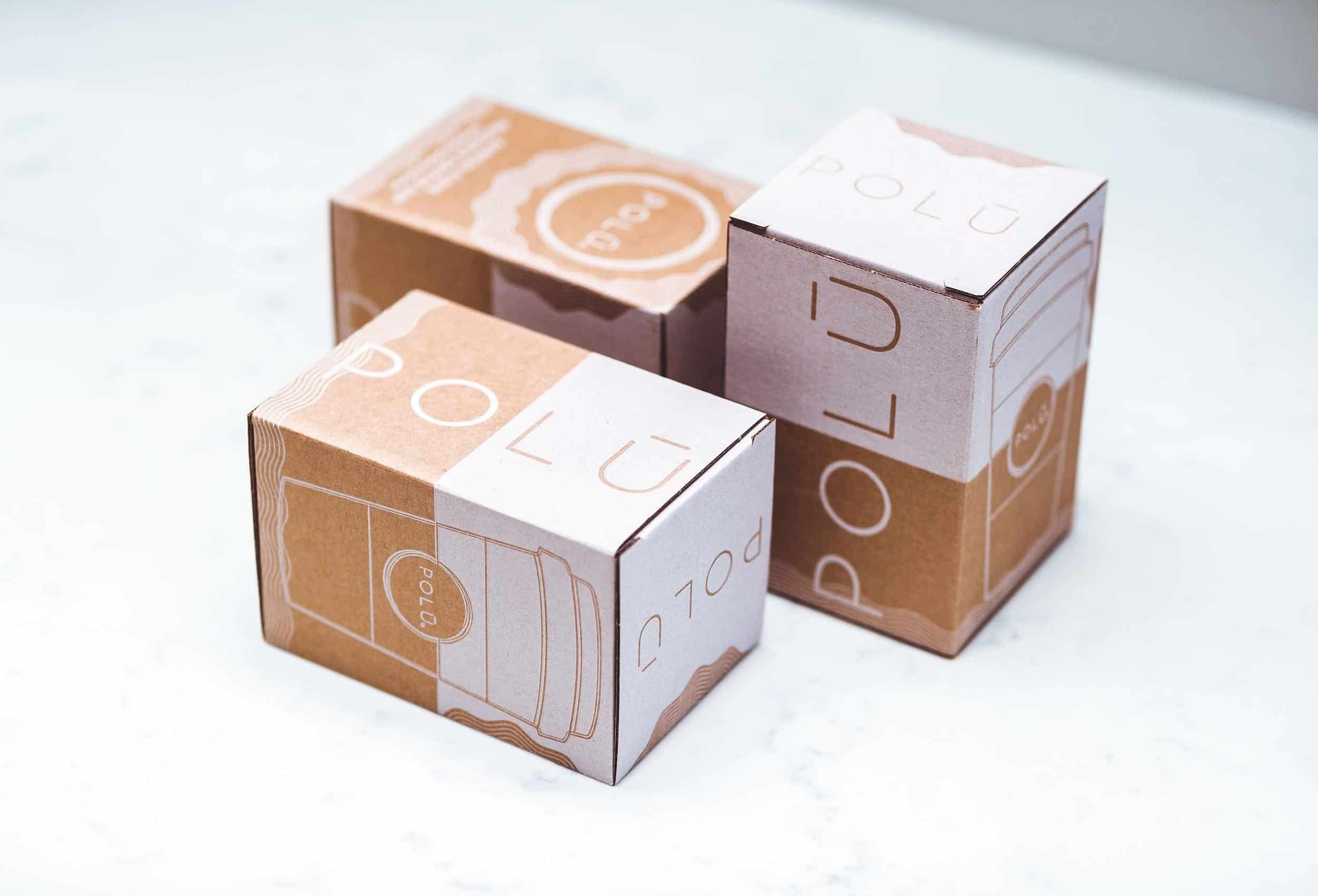
Pro tip: For an extra unique finish, consider using white print on Kraft
Finish
If the simple cardboard box isn’t enough, there’s a swath of other features that you can use when designing your packaging.
Foil and hot stamping transfer a shiny, reflective surface into the top layer of cardboard and is a great way to show a little extra class.
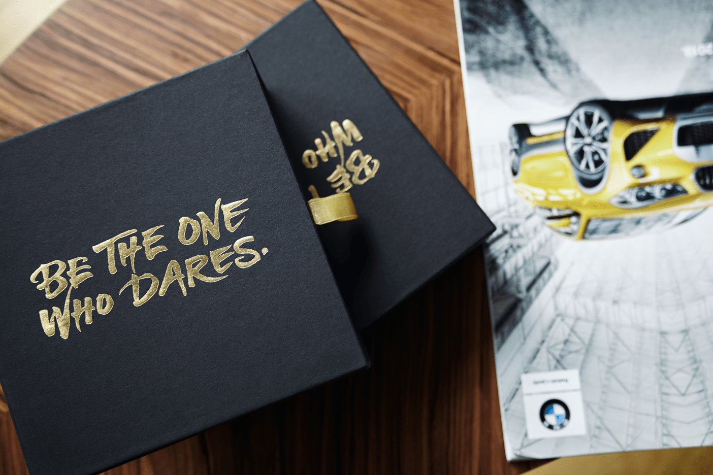
Embossing is when you have a design that’s pressed into the surface from behind, creating a raised section. This can be text or an image, and the raised area can also have a different colour ink or even a foil.
Debossing is the opposite process and can create a unique, eye-catching effect on store shelves
UV Varnish makes text or an image shiny and smooth to touch on an otherwise course layer of laminate.
Copy
The copy, or words you use on your packaging, are another element that takes your brand’s personality onto your packaging.
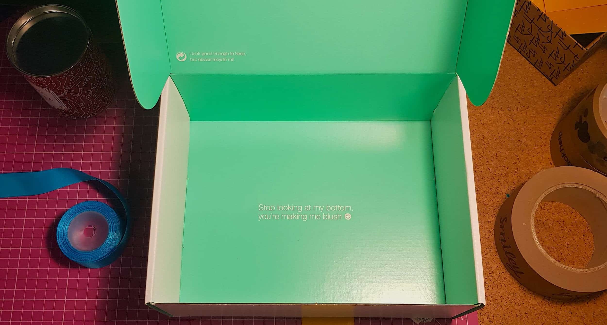
Again, your tone of voice is something that should be decided when you’re designing your branding. If not, here are a few tips on using copy in your packaging design:
1. Clever, witty copy helps create a memorable unboxing experience and makes it more ‘sharable’.
2. Professional copy and powerful word selection is great and build trust and authority. For expensive or one-of purchases, this is essential.
3. Product packaging is a great place to use text that assures buyers that they’ve made the right choice.
Illustrations
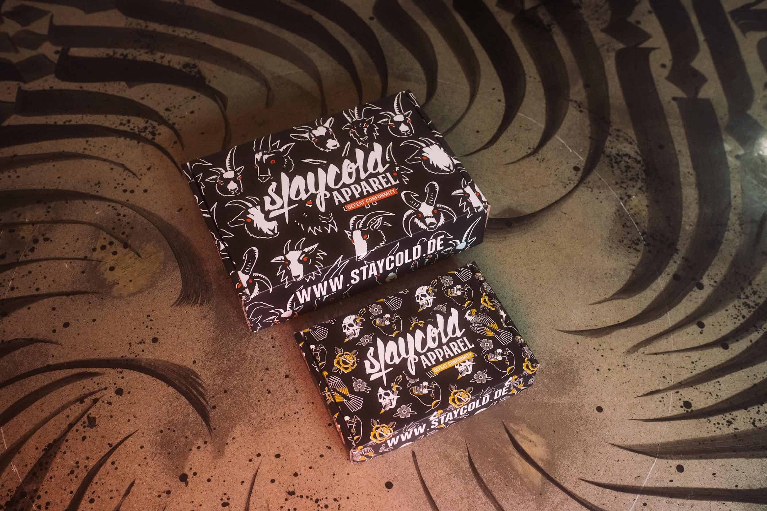
Using detailed and intricate patterns on your product packaging, both internally and externally is a great way to make your customer feel like they’ve got value for money.
Whether it’s light, watercolours over all 6 sides of your box, or bright, fluro branding on a subscription box, illustrations can make your box something truly unique. It’s also an issue trying to find out where to get your packaging for a subscription box.
If you plan on using detailed designs on all surfaces of your product packaging, consider using a dieline.
A dieline is a flat, 2D representation of your unfolded box that helps the designer create a more complete package design, rather than each surface individually. It also helps the printer correctly determine the layout and position of all elements.
Over to you
Packaging design is easy.
Designing packaging that echoes your brand’s message, morals and unique selling points is incredibly hard.
But using the above tips, you’re well on your way to creating something that can blow your customers’ mind!
You may also like: Does Product Packaging Contribute To A Product’s Success?
You may also like: Why Do Packaging Services Need A Marketing Strategy?
Image source: Packhelp.com

Much obliged to you for this blog in this blog all data is specified which I was hunting about product design
I agree with you that well-planned packaging will attract first-time buyers, which is why companies or start-up businesses must give importance to this. You’re also right that aside from the design, the packaging must be functional as well. Personally, I believe that companies must work with a reputable digital printing service that will be able to provide good quality results.