Click here to get this post in PDF
With the mobile explosion in full force, companies are fast switching to mobile commerce. In fact, mobile sales are projected to account for 54% of total eCommerce sales by next year. This means that you should seriously think about crafting a stellar mobile eCommerce experience for your customers. Here are some fantastic tips for designing a mobile-friendly eCommerce site that your customers will love.
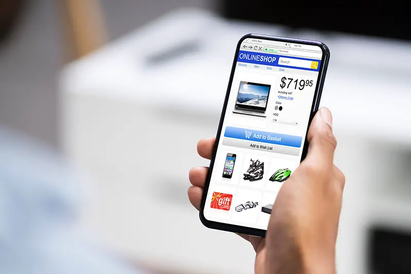
Work on your Product Pages
Each product page that your customer ends up on should ideally be optimized for mobile too. Since compelling Product descriptions go a long way towards convincing your customers to finalize a purchase, be sure that these snippets of text are not lost on a smaller screen. To optimize your product pages for mobile devices, you can minimize the amount of information you include here. Be sure to communicate your product’s unique selling proposition in as few words as possible and include a few product pictures as well as a catchy call to action. This technique helps keep the user’s attention riveted on the most important page elements. Any extraneous content can be grouped into smaller navigable sections that users can click on to expand if they wish to see more and it is easy for visiting online stores via mobile devices.
Limit one call-to-action (CTA) per page
Even on the desktop, too many CTAs can make a page look cluttered and only serve to create friction for users. When you factor in the limited screen real estate of mobile devices, the situation becomes far worse. Cramming too many CTAs on a single page can wreak havoc on your conversion rate optimization and complicate the flow of the site. If you are optimizing an Ecommerce website for mobile, limit the number of CTAs to only one per page.
Create Finger-Friendly Buttons
Yes, your call-to-action button should indeed be designed well enough to attract eyeballs and be updated with catchy content; the size and location of the CTA also influence how frequently it is clicked on. Remember that fingers are larger than mouse pointers, and your mobile real estate is much narrower than desktop browsing. If you want users to click on the CTA, ensure it is given enough space on the screen and doesn’t have any other button or a clickable link within a finger’s breadth. Ideally, customers should be able to click on it without having to change their hand position. Consider the way you hold your phone; Due to your usual thumb position, it is easier to click buttons when they’re in certain spots.
Don’t Include Pop-ups
As if pop-ups are not annoying enough, they are difficult to close on mobile devices. Similarly, sidebars can eat up the already limited real estate of mobile devices and distract users. So again, the only solution is to disable pop-ups on mobile or use a link that triggers the pop-up from within your content.
Simplify Your Mobile Forms
We all know how cumbersome it gets to fill up forms on mobile devices. Nobody will scroll through pages, typing and tapping away when they can just leave your site and move on to a competitor. If you want to improve the user experience, try to limit the number of fields requesting information from the user and only include the essential fields. Additionally, form labels should be easily understood without context. To improve your mobile form interaction, be sure to disable auto-correct since you don’t want users to inadvertently input wrong or incomplete information due to auto-correct. Similarly, remember to leave enough space between form fields so that users won’t have difficulty filling inside the right fields, but not too much space, or you may create the need for unnecessary scrolling. Last but not least, make sure your keyboard adapts to the content type you need for a form entry.
Allow Quick Login/Checkout
It can be really annoying to have to type in the same details over and over again, and that too on a mobile screen. If your login/checkout process is lengthy, you will lose out on a major chunk of your users. A great idea is to make social media login via Gmail, Facebook or any other favored social networks so that users are alleviated from having to input the same information again and again. Also, users sometimes find that if they input even one piece of incorrect information on a form, all the other details vanish and have to be entered again. Make sure that users are able to correct that particular field and carry on with the checkout process without having to refill the entire form. You can also enable autofill to minimize the amount of information a user has to type in.
Allow Thematic Product Browsing
It can be overwhelming to be presented with hundreds of product options on a small screen and having to scroll down endlessly. A much better option is to promote thematic product browsing, where users can browse products by themes, such as size, length, price, occasion, style, etc. Thematic browsing can really serve to enhance the user experience and make it easier for users to narrow down their listings based on what they actually want. In addition, consider creating features such as finders, assessments, or guides to help users find relevant products.
Make sure your CTA is prominent
You don’t want your users to blindly look for the “add to cart” button after they have selected all the product options. Keep in mind that your users have a rather short attention span and are prone to close a site mid-purchase if they find it cumbersome. Make sure to include a visible and a prominent Call-to-action, such as ‘Add to Cart’ or ‘Buy Now’ – as it will simplify the browsing experience. The highest conversation rates are seen when the call-to-action button is below the right amount of copy. For instance, clients who previously bought the same products from you aren’t interested in product details. Give these prospects a call to action at the start of the product page to keep their momentum going. On the other hand, if a prospect is a first-time buyer, you need some strong, clear copy to convince them before they hit that CTA.
You may also like: 5 Effective Ways to Optimise Your eCommerce Store
Image source: Dreamstime.com