Click here to get this post in PDF
The person who came up with the adage “a picture paints a thousand words” couldn’t be more correct.
Pictures indeed convey more than pure words can, but you can only have your audience see so much of those, so you should grab the opportunity each time you can.
A professionally designed image, or any graphic for that matter, serves as a welcoming mat to your business, idea, or event.
How could you convince people to avail of your product or go to your events if your welcoming mat does not look welcoming?
If you want to make your designs look like how graphic designers do it, say no more because here are some tips on how you will make your design look professional.
Consistency is key.
There are tons of colors, fonts, and images to choose from, and you may be tempted to try them all for your current design. However, you should try to stick to the brand guidelines or event themes.
Doing so provides a sense of unison with your existing or future designs, making your branding more noticeable.
However, remember that experimenting with different elements is not undesirable in certain cases. If your design has something to do with a playfully chaotic theme to match certain events, then you may do so.
Take Marvel’s title card for Loki, for example. The series itself has something to do with the God of Mischief’s variants, hence the fittingly and consistently inconsistent design.
Harmonize your colors.
If you have no existing brand guidelines and are just starting from scratch, it would be wise to pick colors that complement each other. This way, your colors will not clash with the overall design.
You should also match the colors present in your design’s elements with that in the background. For example, an image with a predominantly blue background may be complemented with a blue text.
However, you should use a different and complementary color for the text holder.
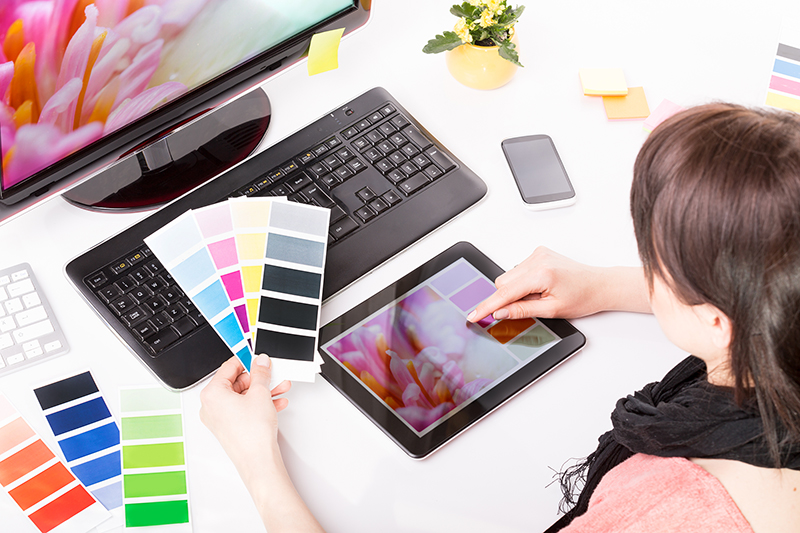
Using a color picker such as this one also helps you match colors from different elements more accurately and effectively by letting you know the exact color’s hex code.
Keep your text noticeable and readable.
To make your designs speak a thousand words, you should add several actual words. And to make those texts stick with the audience better, you should fit them perfectly with your design.
Texts should be big enough to be read while small enough to keep the main purpose of your design conveyable.
If your purpose is for your audience to read those texts (like in motivational posters), then you should position it in a way wherein other elements are secondary.
Your letters should also be properly spaced to make it easier for your message to be highlighted. Kerning typography, as defined by Ana Darstaru of Cretopy, is the spaces or adjustments between different characters.
Again, some designs can be exceptions to this tip. If you’re looking for a purposively chaotic design, you may skip this skip entirely while ensuring the consistency of your elements.
Make your text impactful.
If you are designing an advertisement that aims to invoke emotions in your viewers, consider using short but powerful statements.
Your audience only has a short time to look, and barraging them with too many words is very likely to kill their initial attention.
However, if your advertisement aims to inform, it is acceptable for your design to be a bit wordy only if the information present is crucial to your objective.
Remember, shorter phrases are better remembered than longer ones.
Align your elements properly.
Proper alignment of elements goes a long way in making designs as it guides the viewers’ eyes to the main and secondary elements that you want them to see.
You can easily use grid templates available in design software for this. Not only will it give your design a sense of optical continuity, but it will also give it some compartmentalization and depth of view.
Avoid using too many fonts.
Using too many fonts dilutes your audience’s attention to your main message should it be written in text.
Canva suggests choosing two contrasting fonts such as Bebas and Montserrat, Open Sans Extra Bold and Cooper Hewitt, and many more.
The general tip is to pair a heading-suitable font (fonts that are emboldened, thick) with a subtopic-suitable font (fonts that are light and thin).
Shapes, icons, and images are sometimes better than words.
According to Harris Eisenberg, executive vice president of Thermopylae Sciences, the human brain can process an image 60,000 times quicker than written text.
This means that the most efficient way of conveying information is to use shapes, icons, and images.
For example, population surveys may be easily represented through pictographs or pie charts instead of numbers. This way, readers have a clearer point of reference to what they’re looking at.
Conclusion
Designing things is meant to be fun and personal. After all, it is you who births shapes and colors to your idea.
Stepping up your designing game may be a bit of a learning curve for some, but there’s nothing that constant practice and learning can’t achieve.
Look at what inspires you, be it other people’s designs or nature, and take some time to internalize those.
Remember, the best designs are those that you poured your effort into doing.
You may also like: 8 Graphic Design Trends that Will Define 2022
Image source: Shutterstock.com