Click here to get this post in PDF

Brochures are the best method of explaining more about your business. You can use it as a menu, it is a way of connecting with your clients, and you can also provide elaborated details about the services and goods you offer. You can also use it to tell your story. They are very easy to make, and their uses are not just limited to businesses. Brochures can be used to get the word out about numerous other types of events and causes. There are even online brochure templates for funerals now. A brochure can be designed for anything you can imagine.
If you are looking for more conventional, business uses for your brochure, here is a guide to help you create a good one. You can also checkout SundaePrint.com for more information.
1. Use the cover to command attention
Create a cover that is appealing to your potential clients. For such a cover it has typically a clear design that consists of three components.
The components of custom brochure printing should include; the logo of your firm, an outstanding image, and a captive phrase for the reader to be eager to learn more about your company.
For your phrase to be effective it should have fewer words (less than ten), in large type, and should be at the top of the flyer.
2. Use irresistible text to attract attention
The design of the cover might make the clients pause. But, if the information on the cover is appealing, anyone can pick up the folder and read it. You can use several techniques to excite the curiosity of the reader to look closely. One of the methods is starting a clause on the cover and then continuing it inside the flyer. The other form is asking a question on the cover and providing an answer within.
3. Use color to set the tone
Color is a good technique to set the inclination of your message. In the case where your business is whimsical and fun, you should use bright colors to bring out this perception. If you are displaying serious business content, you should use neutral hues and colors.
4. Select the appropriate font size and font
Choosing the correct font also helps to set the desire for your information. Avoid using Comic Sans, if your booklet is about surgical center.
In this case, you should ensure that you use the right font which is easy to read. While designing flyers, you should use different font sizes to show the significance of your information.
The most relevant details should be in the largest font size, while the subheadings are in a smaller font size. Using different font sizes brings about visual interest.
5. Use photographs to make your flyer look more lively
Use images and pictures to communicate your firm’s information without using text. You should not overuse them. However, you can use 2 to 4 images so that the reader will not be overwhelmed.
6. Select a suitable fold
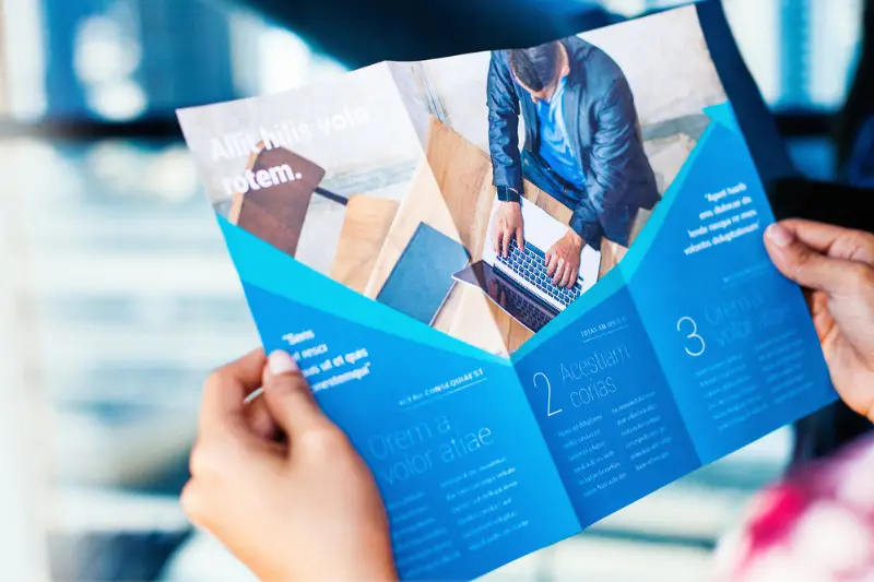
There are two familiar types of booklet folds; trifold and Z-fold. In case there is a lot of information, then you should use a Z-fold.
In this fold, one panel is displayed at a time. This helps to prevent the reader from being attacked by too much information.
You cause trifold in cases where your folder has less content and also a large centered picture. See this link to know how you can create effective marketing brochures https://www.businessknowhow.com/directmail/ideas/brochures.htm
Steps to Creating a custom brochure
Before creating a brochure, you need to have certain content. Here is the content you should have;
1. A logo
In case you have a logo, use the highest resolution version so that it comes out well when printed. If you do not have a logo, you can ask a designer to create one for your company.
2. Images
Choose some of the best photos of your services and products. You can also include one with your team. They should be of high quality.
3. Texts
It should include;
- An introduction
A flyer is an opportunity to talk more about what you represent and who you are, in terms of product quality, personal services, and reliability.
- Service/ product information
Come up with information saying what your business is offering.
- Contact details
In this section, you should provide contacts or emails in which your potential customers can get in touch with you. You should also include your working hours.
Developing your custom brochure
1. Select your format
Have a look at your information and think of the purpose of your folder. This will enable you to decide on the best layout to use. To decide on this one, pick a piece of paper, fold it into either of the formats (Z-fold or trifold), then write down the information you will put on each side. This will help you envision the layout and choose the best.
2. Choose the template design
There are several template designs that are available. Filter by your company, then select your colors. You can also upload your label for you to find a match color taste. For you to have a clean look, it is advisable that you stick to one or two colors.
3. Write down your content
After you have selected your template, start feeding it with your information and edit as you continue. Make use of headings to differentiate your text and stick to one or two fonts. You can also try several options and move things around.
4. Select your paper and finish
When you are satisfied with the layout, select a paper that fits the format of your flyer. You should keep in mind the various ways you are going to use it. Click here for more brochure design ideas.
Conclusion
It is often a great feeling when you see your work being appreciated. When making custom brochures, it is fulfilling to see your prints being put to work. Select the locations you can display them to captivate potential clients. You can also distribute them in your place of work or even bring them to a trade show. At the end of it all, you will see that they are one of the most versatile and important marketing materials. If you are having trouble trying to make your own custom brochures, this simple guide will help you to get started.
You may also like: Here’s How Promotional Products Make An Impact On Building Brand Image
