Click here to get this post in PDF

In today’s digital age, almost everyone (and everything) is connected to the Internet. Look around and you’ll instantly spot multiple people walking with a smartphone in hand. And who can blame them? Technology has made the lives of people much easier. It has carried so much influence that online connectivity isn’t the future; it is the present.
As a business owner, there are many ways to influence customers, and a great website is one of the first things you should have if you want to make a lasting impression.
After all, when people encounter a brand or business they haven’t heard of, the first thing they do is look it up online. This is why it is crucial to have a good web design. On average, millennials now make 54% of purchases online, and data from Smart Insights reports that 38% of people will leave a site if they find the layout unattractive. So what web design rules should you follow to make your site attractive right from the get-go?
Making Your Website Enticing and Effective
To make your website look great, take note of these useful web design principles.
Purpose
An effective website must have a clear purpose. Are the users in your website there to be informed, be entertained, or make a purchase?
Clear Message
Your website must be able to communicate its message clearly in just a matter of seconds.
Easy-to-read Typeface
Your website should have an easy-to-read typeface that fits your brand’s image.
Attractive Colors
Just like typefaces, your website should have on-brand colors that are neither loud nor distracting.
Minimal Images
It is a common mistake for beginners to overuse images on their website. Give your website a minimalist appeal and keep these to a minimum.
Easy Navigation
Make sure your website is easy to navigate. A less responsive and user-friendly website puts you at risk of losing more customers.
F-Layout
When designing your website, remember that users usually scan content in a horizontal then vertical movement, forming what experts call the “F” Pattern.
Quick Load Time
People want access to information as quickly as possible. That’s why your website’s load time should be as fast as possible.
Mobile-friendliness
The Business Insider reports that almost 60% of customers spend their online shopping time on their mobile devices. Keep your website as mobile-friendly as possible.
A Closer Look at Web Design That Works
You never get a second chance to make a first impression, and that’s what makes your website so important. Your homepage serves as your virtual front door, and if your customers don’t like what they see, there’s a chance they might hit “back” or move to a competitor site.
Not every page is perfect, but there are a few that get it right. As a business owner, your website should follow the web page design principles mentioned previously. It helps to look at three brands for inspiration for effective web design—and these include Apple, Cyrus Rugs, and Seriously Unsweetened.
Hook Audiences with Impressive Above the Fold Content
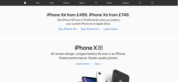
Upon viewing the above the fold section of these websites, you will see that it communicates what products each brand offers. In the above screenshot, it’s clear from the website that it sells iPhone gadgets.
From the home page, you are immediately greeted by pictures of the brand’s iconic phones. The site also has a navigation bar that provides access to their different products.
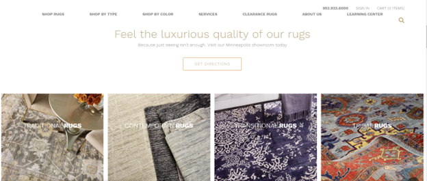
The above the fold section in the above screencap contains a tagline that says the brand offers luxury rugs at a price the customer can afford. There is also a link to the navigation bar that redirects to products sold at discounted prices. On the upper-right section, the contact details are also visible, making it easy for the customer to get in touch.
Engaging Visuals that Communicate Your Brand’s Message
The above screenshot shows how a website’s visuals can communicate an engaging brand message. The color scheme is made up of white and gold, allowing vibrant colors of the products to stand out. The typeface is simple yet sophisticated, while the images look like they were taken from a lifestyle magazine.
The website in the screenshot boasts a minimalist design, making it look incredibly eye-catching. The color scheme and images communicate youth and playfulness. It’s simple yet bold color scheme gives the site a distinct appeal that is perfect for attracting more customers.
Enhance the Browsing Experience with a User-friendly Website
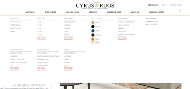
The navigation is another tick on the web design principles checklist. As seen in the photo, viewers will find these quickly thanks to the intuitive drop-down menu and user-friendly features on the website.
On a similar vein, the site is also designed to adapt to mobile screens because of its responsive web design. This increases a visitor’s potential to be converted into a buyer, especially when shopping on mobile.
Make a Web Design That Sells
These days, businesses need to go beyond attracting potential customers to their physical stores. The key to survival in this ever-changing digital world is adaptation. Start by having an impressive website that sells. Attention spans are now shorter than ever, and that is why you have to catch their attention as soon as possible with a site that follows the principles of beautiful web design.
You may also like: 7 Web Design Mistakes That Can Destroy Your SEO


[…] You may also like: The Secrets to Creating a Website That Sells […]