Click here to get this post in PDF
As we race towards the starting of 2018, it’s time to spare a thought for all those design trends that have stood you in good stead during the last year and give thought to those that are likely to become your new best friends during 2018, whether for upping your SEO Stockport score, or for decreasing your bounce rate. Here are just 6 of the top web design trends that look set to be in the forefront for 2018. If you are looking to upgrade your website in 2018 some of these new trends may well be worth suggesting to your website designer.
Asymmetrical grids
Split screen designs might have been the big thing during 2017 but they are so last year; perfect symmetry is out and in its place, will be a more asymmetrical look. 2018 should see designers splitting the visual elements on their screens into a more asymmetrical pattern. To make the best of this concept careful consideration should be given to making sure that there is balance and that neither side of the design overpowers the other side.
Colour
Bright colours might have been big in 2017 but it certainly looks they will be hanging around for 2018 as well. Bright colours and bold fonts will really complement the more modern look of the asymmetrical grid design. Colour might even replace images on some sites which is good new for mobile apps where images can often slow your page down, frustrating potential customers.
Bottom sticky elements
We know people read from left to right but consider this – users who are on smartphones are used to clicking at the bottom of their screens, and smartphone use is on the up. For this reason, it makes sense to make sure that your sticky menu items are scrolling from the bottom of your screen. These things might already be on their way in, but they are certainly set to stay as designers respond to demand.
Internet of things
This is another trend that was big in 2017 and is almost certainly going to continue into 2018. From fridges to smart light bulbs IoT covers all sorts of devices. Expect to see the technology on websites allowing interaction with smart devices in 2018 as smarter website are created.
Virtual reality video
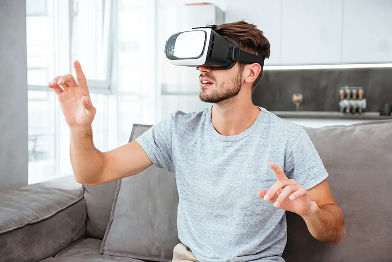
2017 saw a rise in the numbers of videos use on websites, many of them offered a video introduction; a look at the faces behind the products. 2018 seems set to carry on this trend but in bigger and better ways, you could expect to see 360 videos, video mapping and even interactive videos appearing on many websites; and whilst these videos are costlier and time consuming to create they certainly pack a punch.
Scroll triggered animations
Scroll animation is a great way to encourage users to continue scrolling down your webpages, and whilst these are certainly not a new thing they are beginning to appear in a variety of new formats. With almost every company having a website you want something that makes your website more memorable and helps it to stand out from those of your competitors and use properly scrolled animation can do just this. It doesn’t have to be over the top, minimalist or strategic is often the best approach.
Whichever of these trends you feel you want to follow in 2018, make sure that you keep your website fresh and exciting – after all, it is effectively a shop window that is open 24/7 all year round.
Also read: 4 Web Design Tips for Small Businesses
About the Author
I am Sienna Hoddle. Passionate writer and likes to write about unique travelling ideas and home improvement,Business, Health & Beauty, Technology, & much more.


I don’t think VR videos have many applications on most sites (yet) but they have huge potential on things like real estate websites and apartment websites. You don’t even have to visit the place in person anymore, you can just tour it online.