Click here to get this post in PDF
There’s a fine line between a beautifully styled surface and one that looks like it was copied from the same showroom formula everyone else has seen a hundred times before. Coffee tables, consoles and sideboards have enormous influence over how a room feels, but styling them well is less about following rigid “rules” and more about creating a sense of balance, character and ease.
The problem is that many homes fall into the same familiar pattern: a candle, a stack of books, a vase, perhaps a tray, all arranged so neatly that the space feels more staged than lived in. Good styling should still feel considered, but it should also feel believable. It should reflect the mood of the room, the way you actually live, and the pieces you genuinely enjoy having around you.
That starts with choosing furniture that already brings presence into the room. A strong foundation, whether that’s a sleek console, a textural sideboard or a set of black coffee tables, does a lot of the heavy lifting before a single decorative object is added. Once the furniture itself has personality, the styling can become more nuanced and far less formulaic.
Stop Styling to Fill Space
One of the biggest mistakes people make is feeling that every surface needs to be “finished” with décor. In reality, negative space is part of the styling. A coffee table with a few well-chosen items and room to breathe often looks more refined than one crowded with accessories from edge to edge.
The same goes for consoles and sideboards. These pieces often sit against walls, under artwork or near entryways, which means they already play an important visual role in the room. Overloading them can make the entire space feel busy. Instead of asking, “What else can I add?”, it’s often better to ask, “What can I remove so the right pieces stand out?”
Styling without clichés begins when you stop treating décor as filler and start using it as punctuation.
Think in Contrasts, Not Matching Sets
A room becomes more interesting when surfaces are styled with contrast rather than coordination for its own sake. That might mean pairing a refined ceramic piece with something rougher and more organic, like timber or stone. It could mean placing a sculptural object beside a stack of worn books, or balancing a sleek lamp with something handmade and imperfect.
This is where many clichéd styling arrangements fall flat. They often rely on objects that are all the same visual language: same colour family, same finish, same level of polish. The result is cohesive, perhaps, but also predictable.
Contrast creates tension in the best way. It gives the eye somewhere to move. A sideboard, for example, might feel far more compelling with a mix of matte and gloss finishes, curved and angular forms, old and new pieces, rather than a row of matching decorative accessories bought all at once.
Style for the Shape of the Furniture
Not every surface should be styled the same way, because not every piece of furniture does the same job.
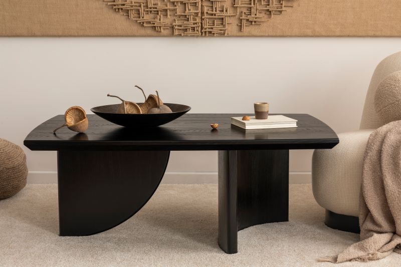
A coffee table sits at the centre of activity. It needs to look good, but it also needs to allow for practical use. Drinks go there. Books get picked up and put down. People put their feet up, even if they swear they never do. Styling a coffee table should account for real life, which usually means keeping the arrangement lower, more grounded and easy to move.
Consoles are often more vertical in their styling because they tend to sit against walls. They can handle a lamp, a taller vase, a leaning artwork piece or a mirror above, because they’re often part of a broader visual frame.
Sideboards sit somewhere in between. They have enough surface area to hold presence, but they also benefit from restraint. Because they’re usually larger pieces, they don’t need dozens of objects to make them feel complete. A few substantial elements with variation in height and texture often work better than lots of small décor scattered across the top.
Choose Objects With a Point of View
If you want to avoid clichéd styling, choose fewer objects with more personality. Generic décor tends to create generic results. The pieces that make a surface feel elevated are usually the ones that suggest something about the people living in the home.
That could be a vessel picked up while travelling, a favourite art book you actually open, a handmade bowl, a vintage find, or a sculptural object that has an unusual silhouette. Even practical items can contribute to the look if they’ve been chosen thoughtfully.
What matters is not whether every item is expensive or “designer”. What matters is whether it feels intentional. A surface styled with meaning will almost always feel more sophisticated than one styled with trend-driven filler.
Avoid the “Rule of Three” Trap
The “rule of three” has become one of those styling ideas repeated so often that it can lead to rigid, overly obvious arrangements. Yes, odd numbers can sometimes feel more natural to the eye, but if every surface in a home is built around three objects of different heights, the styling quickly starts to feel rehearsed.
Sometimes two pieces are enough. Sometimes one large statement object does more than five smaller ones. Sometimes a broader, looser arrangement feels better than a tightly grouped cluster.
Rather than forcing objects into a pre-decided formula, pay attention to visual weight. A heavy object may need something delicate nearby to balance it. A tall piece may need a lower, wider element to ground it. Styling works best when it responds to proportion, rather than blindly following a decorating mantra.
Let Books Look Like Books
Books are one of the most overused styling tools, largely because they’re often used in ways that don’t feel natural. Endless stacks of colour-coordinated hardcovers can start to feel more like props than part of a real home.
That doesn’t mean books should disappear from styling altogether. They can add warmth, height and personality, especially when the titles genuinely reflect your interests. But they don’t need to be arranged like a shop display. A small, imperfect stack is often enough. An open book placed casually can feel more authentic than a pile arranged purely for symmetry.
The same principle applies across styling generally: objects should look as though they belong in the room, not as though they were assigned there by a checklist.
Use Height Carefully
A common styling cliché is the dramatic tall arrangement that looks impressive for a moment but overwhelms the furniture beneath it. Oversized branches on a coffee table, for instance, can obstruct sightlines and make the room feel impractical. On the other hand, styling everything too low can make a surface feel flat and unconsidered.
The sweet spot is variation with purpose. On a console, a lamp or tall vase may add structure, especially when paired with something lower and broader. On a sideboard, a single taller piece can work beautifully if the rest of the arrangement is restrained. On a coffee table, lower styling is often better, with height introduced through layered trays, bowls or stacked books rather than towering objects.
Height should support the furniture, not compete with it.
Bring in Texture Before Colour
When people want a surface to feel more interesting, they often reach first for more colour. But texture is usually the more effective tool. A room with layered texture feels richer, calmer and less forced than one relying on bright decorative accents to create energy.
For coffee tables, consoles and sideboards, this might mean combining smooth ceramics with natural timber, woven elements, stone, linen, glass or metal. Even within a neutral palette, these shifts in texture can make a styling arrangement feel deep and considered.
This approach also helps create longevity. Trend-heavy colour pops can date quickly, while texture tends to feel more timeless and quietly luxurious.
Don’t Make Every Surface Perform the Same Way
One of the fastest ways to make a home feel repetitive is to style every horizontal surface as though it belongs in the same room doing the same job. If your coffee table, console and sideboard all feature the same books, same candle, same vase and same tray arrangement, the house can start to feel visually monotonous.
Each surface should contribute something slightly different. Maybe the coffee table feels relaxed and tactile. Maybe the console is more architectural and framed. Maybe the sideboard is anchored by art and a few larger sculptural pieces. There can still be a consistent thread across the home, but it shouldn’t feel copy-and-paste.
Styling is far more effective when there’s rhythm rather than repetition.
Let the Room Influence the Styling
A beautifully styled surface doesn’t exist in isolation. It should respond to the rest of the room. A minimal contemporary space may suit cleaner arrangements with bolder shapes and fewer objects. A softer, more layered interior may welcome collected pieces, warmer materials and a looser arrangement.
Light matters too. In a darker room, reflective finishes or lighter-toned accessories can help lift the surface. In a bright room, deeper finishes and more grounded materials can create balance. The architecture, furnishings and mood of the room should all influence how you style the furniture within it.
When styling feels disconnected from the surrounding space, it often reads as artificial. When it feels responsive, the room as a whole becomes more convincing.
Leave Room for Real Life
The most successful styling is never so precious that it can’t be lived with. A coffee table still needs to function as a coffee table. A console in an entryway might need to hold keys, post or a bag dropped at the end of the day. A sideboard may need to serve practical purposes during gatherings or everyday life.
That doesn’t lessen the importance of styling. It simply means the best arrangements allow beauty and function to coexist. In fact, that’s often what makes them feel less clichéd in the first place. They aren’t there just to be looked at. They’re there to support the way a home actually works.
The Best Styling Feels Slightly Unscripted
Ultimately, the difference between clichéd styling and memorable styling comes down to restraint, originality and confidence. You don’t need to recreate a showroom vignette to make a room feel polished. In many cases, the more personal, edited and slightly unexpected the arrangement, the better it looks.
Coffee tables, consoles and sideboards should add to the story of a home, not flatten it into something generic. When you focus less on decorating formulas and more on shape, texture, contrast and character, these surfaces begin to feel layered rather than staged.
That’s usually the goal: not perfection, but personality. Not clutter, but composition. And not styling that looks like everyone else’s, but styling that feels completely at home in your own space.
Also read: 5 Brilliant Office Interior Design Ideas You Can Implement
Image source: elements.envato.com