Click here to get this post in PDF
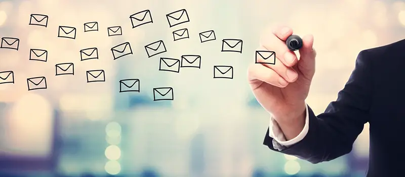
People these days get so many emails, and it’s tough to read them all. In fact, the average person receives 121 emails a day!
However, email remains one of the best ways to stay in touch and provide information to a lot of people, so you may be wondering how you can get more people to read them.
Well, a solid template is the best way to improve your marketing strategy! Here are some great email template tips!
1. Keep Track of Length
Whether you want to chalk it up to people being busy or lazy, the truth is that people won’t read an email if it’s too long.
If you have a lot to say, and you want people to read it, monitor the wordiness of your email, and try to stick to the point as much as possible.
2. Pay Attention to Subjects
The subject is crucial because, after the name of your brand, this is the first thing your audience will see.
Long subjects aren’t always great. Keep them quick, clear, and concise.
One of the reasons for this is that when people read them on their phones, the subject will likely be cut off mid-sentence. This will likely lead to confusion, or even ignoring the email if readers don’t know what it’s about.
3. Personalize It
Emails with personalized subject lines are more 26% more likely to be opened, which isn’t surprising. If you see your name, it feels a lot less “spammy” than a generic email.
4. Format, Format, Format
For an email to have the best chance to be read all the way through, it is best to break up the text. Look at the layout of this very article. Have you read everything so far?
If so, do you think you’d be just as likely to read the whole thing if it was just one big wall of text? This is important to remember. Break up your paragraphs as much as possible!
5. Start With a Warm Welcome
A welcome email is a great way to get people initiated into your email subscription.
From here, let the customer set their own email preferences so that you know you’re hitting the right target audience!
6. Be Funny, But…
We can all agree, humor is a great way to keep a reader engaged. However, we still want to stick to the point to avoid a lengthy email.
7. Make Sure You Mark Your Brand
Yes, a logo is important, and a watermark is great, but there’s much more! Make sure your emails have an aesthetic and feeling that’s all their own.
This can be done with color schemes, pictures of your products or services, animations, font, and plenty more. Find your brand and stick with it!
8. Use Visual Media
Entertaining videos, GIFS, and moving animations capture the eye like nothing else. This will especially work to break up an email with a lot of text so it doesn’t look like too much.
9. Add Social Media
Don’t forget to tag in your social media! Why pass on an opportunity to get your brand some extra Facebook clout?
Make it simple. People are used to these companies’ symbols by now, so they’re enough to just have them on the bottom to direct readers to your pages.
Alternatively, you can try to link them naturally in the email with an anchor text. That is the displayed text you can click on that serves as a link.
10. Resize Images and Text
Make sure your email and all media attached to it are fit to size. This is to ensure your email will look cohesive whether it’s read on a laptop or a phone.
This is especially the case if you’re trying to fit your texts around images in a sort of “F” format.
11. Be Careful with Emojis
Apple emojis are different from Google’s, and different emoticons can vary widely depending on what device the reader is using.
Try to avoid using emojis in your subject line, as this is the first thing your readers will see. If it shows us as a black rectangle because of their device, they may think the email is spam and scroll past it.
12. Dynamic Content
Back to personalization, that doesn’t just have to be for your subject! You can actually change entire sections of the text based on individual customers and their purchase histories! This makes your email chains more relevant and appealing to individual customers!
13. CTA Button
The “call to action”, or CTA, is the last sentence of your email. Use this space to call the reader to act on whatever you want them to.
Grab the reader with a sentence like: “If you want the best equipment for your ultimate backpacking adventure, be sure to check out our products.”
Once you have that, add a link to the text at the end to direct your reader to your products page. You can also direct them to your blog or an affiliate, wherever you choose!
14. Use Online Email Template Resources
That doesn’t have to mean paying a graphic designer or web developer, it can actually be pretty simple. There are great online resources to help you create the best email templates. Check it out here.
Get Creating Today!
Email template formatting isn’t rocket science, but every brand will always have room for improvement! There’s always work to be done, so get started today to get ahead of the competition!
Once you have a killer email template, keep checking in for more ways to improve your marketing methods so you can keep growing your business!
You may also like: Top 10 Amazingly Creative Out-Of-Office Email Inspirations
Image source: stock.adobe.com

